Fully responsive web design
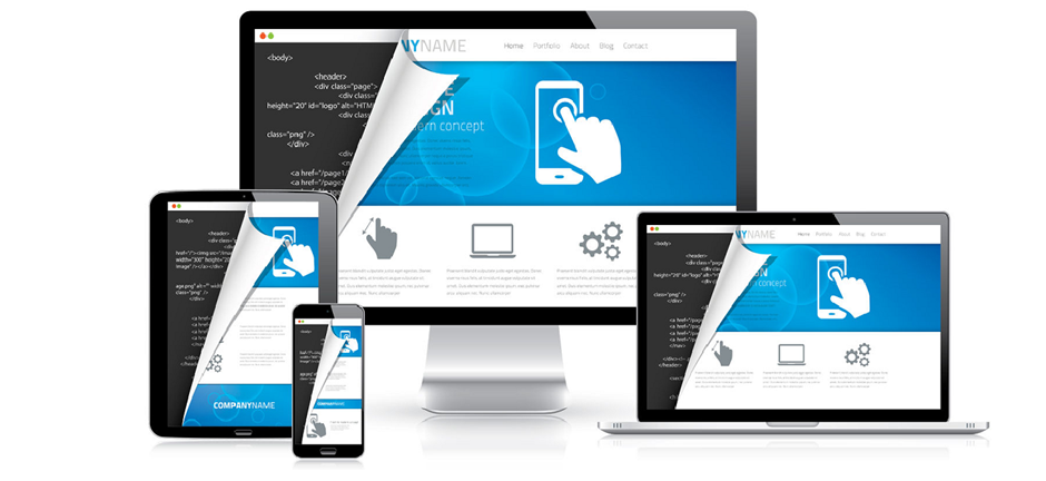
A site designed with RWD (Responsive Web Design) adapts to the viewing environment as in the image above. The trick is to obtain a balance so that the mobile layout and the full screen layout provide equally actractive and usable interfaces. This has been achieved by optimising grids resulting in the common 3 column approach with menus being treated differently.
As stated on our front page teaser, Google is dropping any non-mobile friendly sites from their listings and you can read about it on the BBC web site. http://www.bbc.co.uk/news/technology-32380223
A test is available on https://www.google.com/webmasters/tools/mobile-friendly - all you do is put your website URL into it.
Needless to say IntrepidDigital can address this problem so contact us now before you drop off the Google Search result lists.